Educational content only. This guide explains how candlestick charts work. It is not financial advice, a recommendation to buy or sell anything, or a promise of any result. Trading involves real risk of loss.
Most beginners learn candlesticks backwards. They download a poster of 40 patterns, memorize the names, and then try to spot “a hammer” or “an evening star” in a live chart. When the pattern fails, as patterns regularly do, they conclude that candlesticks don’t work.
The problem isn’t the candles. It’s that they learned the vocabulary before they learned the language.
Knowing how to read candlesticks is not about recognizing shapes. It’s about understanding what each candle tells you about the fight between buyers and sellers during a specific period of time. A pattern name is just shorthand for a story. If you can read the story, the name matters far less. If you can’t, the name is nearly useless.
This guide teaches you how to read candlesticks as a skill. You’ll start with the anatomy of a single candle: the open, high, low, and close, the body, and the wicks. Then you’ll learn a six-step reading workflow you can apply to any candle on any chart. Only after that do we cover the patterns, and each one comes with the context that makes it meaningful or meaningless.
From there we apply the same skills to day trading, forex, options, crypto, and stocks, because each market shapes its candles differently. We finish with common mistakes, a compact cheat sheet, the honest limitations of candlestick analysis, and an FAQ.
One theme runs through every section: context matters more than the pattern name. Keep that in mind and you’ll already be ahead of most people who study candlesticks.
2. What Is a Candlestick Chart?
A candlestick chart is a price chart that shows four pieces of information for each time period: where price opened, where it reached its highest and lowest points, and where it closed. Each period is drawn as a single “candle,” and a row of candles shows how price has behaved over time.
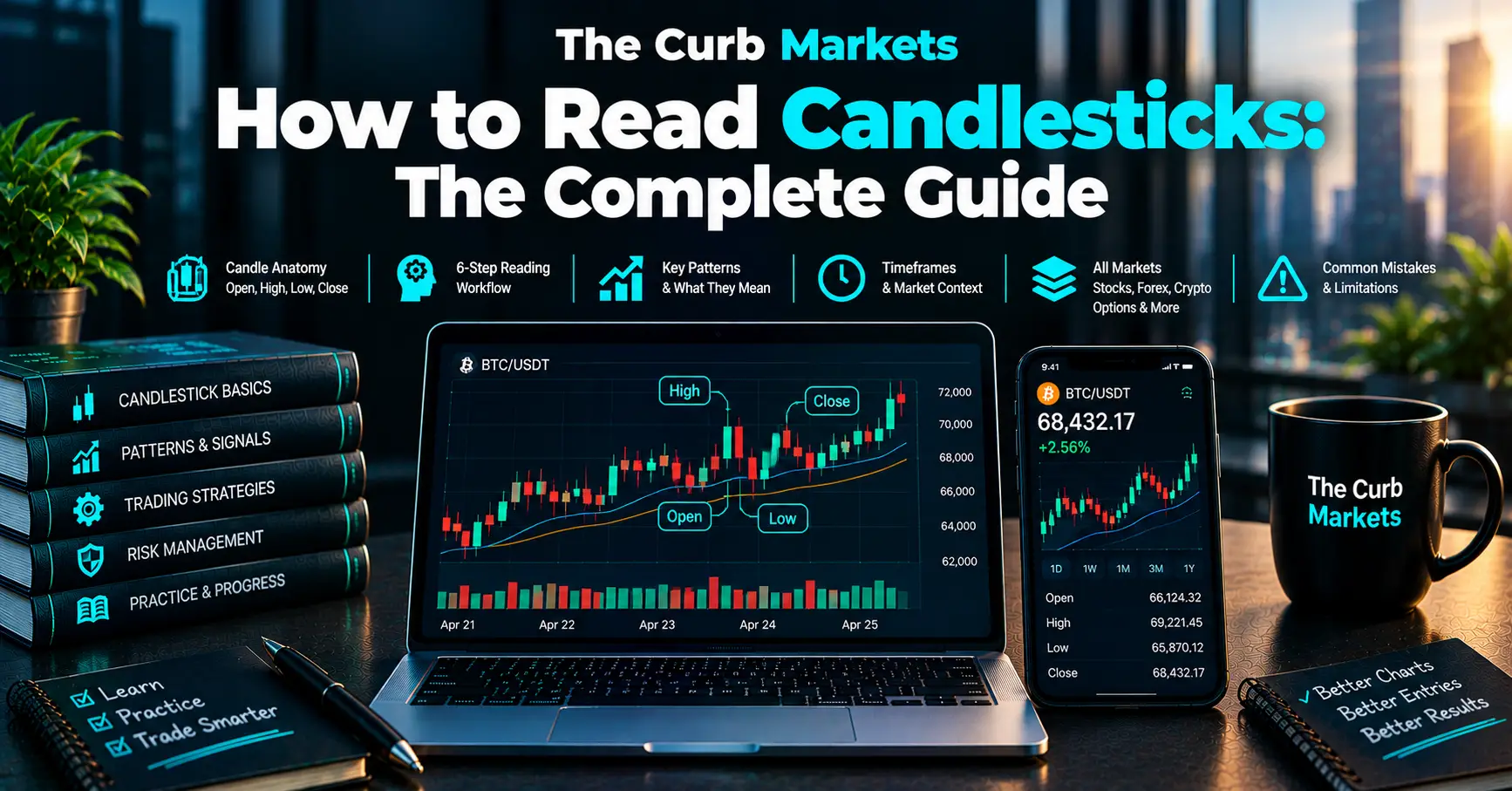
Those four data points are known as OHLC:
- Open: the first traded price of the period
- High: the highest price reached during the period
- Low: the lowest price reached during the period
- Close: the last traded price of the period
A simple line chart connects closing prices and nothing else. A candlestick chart shows the whole journey of each period. Did price spike and collapse? Did it grind steadily upward? Did it swing wildly and end up where it started? A line chart hides all of that, and candles reveal it.
A Brief Origin Note
Candlestick charting is commonly traced to Japanese rice traders in the 1700s. Munehisa Homma, a rice merchant from Sakata who traded in Osaka, is the figure most often credited with developing the approach. The exact history is debated, and much of it is passed down through secondhand accounts. The charting method was introduced to Western traders in the early 1990s, largely through the writing of Steve Nison, and it has since become a standard on virtually every charting platform.
Candles Work on Any Timeframe
A candle can represent any period. On a daily chart, each candle covers one trading day. On a 5-minute chart, each candle covers five minutes. On a weekly chart, each candle covers a week. The mechanics are identical regardless of timeframe, but the meaning changes, which we’ll explore in the workflow section.
You’ll also see candlestick charts called candle trading charts, candlestick graphs, or simply “candles.” They’re all the same thing.
3. The Anatomy of a Single Candlestick
Before reading patterns, you need to read one candle. Every candle has a body, wicks, and a color, and each part tells you something specific.
The Body
The body is the thick rectangular part of the candle. It spans the distance between the open and the close.
- On a bullish candle, the close is higher than the open, so the body runs from the open (bottom) to the close (top).
- On a bearish candle, the close is lower than the open, so the body runs from the open (top) to the close (bottom).
The size of the body tells you how far price moved from start to finish. A tall body means price traveled a long way in one direction during that period. A tiny body means price ended up very close to where it started.
Think of the body as the “net result” of the period. Buyers and sellers pushed and pulled, and the body shows who ended up ahead and by how much.
The Wicks (Shadows)
The thin lines above and below the body are called wicks, or shadows. The two terms mean exactly the same thing.
- The upper wick extends from the top of the body to the high of the period.
- The lower wick extends from the bottom of the body to the low of the period.
Wicks show price levels that were visited but not accepted. If price rose to a certain level during the period, then got pushed back down before the close, the upper wick marks the high. Sellers stepped in at that level and drove price back. A long upper wick is a footprint of rejection from above. A long lower wick is a footprint of rejection from below, where buyers absorbed the selling and pushed price back up.
This is why wicks are so informative. The body shows where the period ended, and the wicks show where it tried to go and failed.
Candle Color and What It Means
Color is simply a quick visual shorthand for whether the close was above or below the open.
- In many Western platforms, green (or white/hollow) candles are bullish, meaning the close was above the open. Red (or black/filled) candles are bearish, meaning the close was below the open.
- In several East Asian markets, including Japan, China, and South Korea, the convention is commonly reversed, with red representing price increases and green or blue representing decreases.
Most platforms let you change these colors, so never assume. Check your platform’s settings before you start interpreting charts, especially if you use more than one.
Two important points about color:
- Color describes the open-to-close relationship within a single candle, not the direction versus the previous candle. On a stock that gaps up sharply at the open and then drifts lower, you can see a red candle sitting well above the previous close. It’s red because it closed below its own open, even though the stock is up on the day. Some platforms offer an option to color candles based on the previous close instead, so know which mode you’re using.
- Color alone is the weakest piece of information on a candle. A green candle with a tiny body and a long upper wick, for example, may signal more selling pressure than buying strength. Always read body and wicks together.
4. How to Read Candlesticks: A Step by Step Workflow
This is the heart of the guide. Patterns are useful, but they’re vocabulary. The workflow below is the actual skill, a repeatable process for working out what a candle is telling you. When you know how to read candlesticks with this process, you can interpret candles that don’t match any named pattern at all, which is most of them.
Apply these six steps to any candle you want to understand.
Step 1: Identify the Timeframe
Before you read a single candle, know what period it represents. A long red candle on a 1-minute chart and a long red candle on a weekly chart are very different events.
Longer timeframes (daily, weekly) represent more participants, more capital, and more time, so signals on them generally carry more weight. Shorter timeframes (1-minute, 5-minute) contain more random noise. A dramatic-looking candle on a 1-minute chart can be a single large order and nothing more.
A useful habit is to check at least two timeframes: the one you trade on and a higher one for context. A bullish signal on your 15-minute chart means less if the daily chart is in a steep downtrend running straight into resistance.
Step 2: Read the Body Size
The body tells you about conviction.
- A large body suggests strong conviction. One side dominated the period and price moved decisively, with little back-and-forth. A large bullish body means buyers were firmly in control from open to close.
- A small body suggests hesitation or balance. Neither side won, and price ended near where it started.
Size is relative. A “large” body means large compared to the recent candles on that chart, not large in any absolute sense. Look at the last 10 to 20 candles and ask whether this candle is unusually big, unusually small, or ordinary.
Step 3: Read the Wick Placement
Now look at where the wicks are and how long they are relative to the body.
- A long lower wick means price fell during the period but was pushed back up. Buyers rejected lower prices.
- A long upper wick means price rose during the period but was pushed back down. Sellers rejected higher prices.
- Little or no wicks mean price barely retreated from its extreme. A candle with almost no upper wick closed near its high, which shows buying pressure into the close.
Wicks are rejection. The question to ask is: which price level did the market reject, and who rejected it?
Step 4: Check the Broader Context
This is where most beginners skip ahead, and where most mistakes begin. A candle never exists in isolation. Ask:
- What is the trend? Is price in an uptrend, a downtrend, or moving sideways? A rejection candle means something very different in each.
- Is the candle at a meaningful level? Is it near a prior swing high or low, a known support or resistance zone, or a round number? Or is it floating in empty space?
- What came before? A big green candle after five small candles reads differently than a big green candle after five big green candles.
Support and resistance are the most important context tools. Support is a price area where buying interest has previously been strong enough to halt declines. Resistance is an area where selling interest has previously halted advances. A rejection wick at one of these levels is telling you the level may still be active. The same wick at a random price carries little information.
Step 5: Check Volume
Volume is the number of shares, contracts, or units traded during the period. It tells you how many participants were behind the move.
A signal that forms on higher-than-usual volume carries more weight than the same signal on thin volume. If a bullish engulfing candle appears on heavy volume, many participants agreed with that move. If it appears on light volume, it may be a low-conviction blip.
The comparison should be relative. Judge volume against the recent average for that instrument and timeframe, not against an absolute number. Some platforms display a volume histogram beneath the chart, and it’s worth keeping on screen.
One caveat: in decentralized markets like spot forex, there is no single central source of true volume. Charts typically show tick volume (the number of price changes), which is an approximation. We cover this in the forex section.
Step 6: Wait for the Candle to Close
A candle isn’t finished until its period ends. Until then, its body and wicks are still changing, and its open, high, low, and close are not final.
A candle that looks like a perfect hammer with ten minutes left in the hour can turn into a long red candle by the close. A “bullish engulfing” in progress can shrink back inside the prior candle’s body before the period ends. Acting on an unfinished candle means acting on a signal that doesn’t exist yet.
Wait for the close. Only then does the candle become a fact rather than a possibility.
How the Workflow Connects to Patterns
Here is the framing that matters: named patterns are just vocabulary for what this process reveals. A hammer is simply what you see when Step 3 shows a long lower wick, Step 2 shows a small body near the top, and Step 4 shows it happened after a decline at support. The name saves you words. The reading is what gives it meaning.
If you run through these six steps on every candle you care about, you’ll often arrive at the same conclusion as someone who spotted the named pattern, and you’ll also correctly dismiss many “patterns” that look right but have no context behind them.
5. Types of Candlesticks and Their Meaning
Candlestick types are determined by body size and wick placement. Understanding the broad categories makes the named patterns far easier to remember.
Long Body vs. Short Body Candles
Long body candles show decisive movement. A long bullish body means buyers controlled the period and price closed near its high. A long bearish body means sellers controlled the period and price closed near its low.
Long bodies are strongest when:
- they appear after a period of small-bodied indecision, signaling a breakout of energy
- they break through a known support or resistance level
- they come with above-average volume
A long body that appears at the end of an extended move deserves some caution. A very large candle after a long rally can sometimes reflect a final burst of enthusiasm rather than the start of something new. Context decides.
Short body candles show restraint. Price moved up and down within the period but ended near where it began. This can mean indecision, a pause in a trend, or a market waiting for news.
A short body by itself isn’t bullish or bearish. What matters is what surrounds it. A cluster of small candles after a big move often represents consolidation, a pause before the next decision.
Some traders use traditional names for these shapes. Candles with no wicks at all are sometimes called marubozu (“bald” or “shaved” candles). A bullish marubozu opened at its low and closed at its high, a one-sided period. Platforms and educators vary slightly in how strictly they define it, and in real markets, perfectly wickless candles are rare, so “nearly wickless” is the practical test.
Doji and Near Doji Candles
A doji forms when the open and close are equal or nearly equal. The result is a candle with a very thin or nonexistent body, resembling a cross or plus sign.
A doji represents a standoff. Buyers and sellers pushed price around during the period, but neither side won. It shows indecision, not direction.
There are several common variations:
- Standard doji: upper and lower wicks of roughly similar length.
- Long-legged doji: very long wicks on both sides, showing large swings in both directions before settling back at the open.
- Dragonfly doji: open, high, and close are at or near the same level, with a long lower wick. Price fell sharply and recovered completely.
- Gravestone doji: open, low, and close are at or near the same level, with a long upper wick. Price rallied sharply and fell back completely.
Near-doji candles have very small bodies but not perfectly equal opens and closes. In practice, the distinction rarely matters. What matters is the message: a market in balance.
A doji is a question, not an answer. Its meaning depends on where it appears. After a long strong advance, a doji can suggest buying momentum is fading. In the middle of a sideways range, it means almost nothing. It’s the following candle that tells you how the question was answered.
Single Candle vs. Multi Candle Signals
Candlestick signals fall into two broad groups.
Single candle signals are patterns formed by one candle: the hammer, shooting star, doji, and so on. They’re quick to spot, and for the same reason they’re the easiest to over-trust. One candle is a small sample of information.
Multi candle signals involve two or more candles, such as engulfing patterns, morning and evening stars, and three white soldiers or three black crows. They’re generally considered more informative because they show a sequence: a change in control that develops over multiple periods rather than appearing at a single moment.
More candles don’t automatically mean a better signal, though. A three-candle pattern in a random location is still a weak signal. It simply tells a slightly longer story in the wrong place.
6. How to Read Candlestick Patterns
Now we get to the named patterns. If you’ve followed the workflow in Section 4, this section should feel like putting labels on things you can already read.
Every pattern below comes with the same honest caveat, and it applies to each one: the same shape means far less without the right context. A hammer in open space, with no nearby support, is weak evidence. A hammer at a well-established support level, after a clear decline, on elevated volume, is much stronger evidence. The shape is identical, but the information is not.
It’s also worth being honest that candlestick patterns are probabilistic tools, not guarantees. Academic and practitioner studies on their predictive power have produced mixed results, which is one more reason to treat them as one input rather than a standalone system.
Pattern Cheat Sheet
| Pattern | Candles | Typical Location | Suggested Signal | Key Confirmation |
|---|---|---|---|---|
| Hammer | 1 | End of a downtrend, at support | Possible bullish reversal | Next candle closes higher; volume rises |
| Inverted Hammer | 1 | End of a downtrend | Possible bullish reversal (needs confirmation) | Strong bullish candle follows |
| Hanging Man | 1 | End of an uptrend, at resistance | Possible bearish reversal | Next candle closes lower |
| Shooting Star | 1 | End of an uptrend, at resistance | Possible bearish reversal | Next candle closes lower; volume rises |
| Doji | 1 | Any, most meaningful after strong moves | Indecision | Direction of the following candle |
| Bullish Engulfing | 2 | End of a downtrend, at support | Possible bullish reversal | Volume expansion; follow-through |
| Bearish Engulfing | 2 | End of an uptrend, at resistance | Possible bearish reversal | Volume expansion; follow-through |
| Morning Star | 3 | End of a downtrend | Possible bullish reversal | Third candle closes well into first body |
| Evening Star | 3 | End of an uptrend | Possible bearish reversal | Third candle closes well into first body |
| Three White Soldiers | 3 | After a decline or consolidation | Bullish continuation or reversal | Strong closes; not overextended |
| Three Black Crows | 3 | After an advance or consolidation | Bearish continuation or reversal | Strong closes; not overextended |
Single Candle Patterns
Hammer
What it looks like: A small body near the top of the candle’s range, with a long lower wick (commonly at least twice the length of the body) and little or no upper wick. The color of the body matters less than the shape, though a bullish body is generally viewed as slightly stronger.
What it signals: Sellers pushed price sharply lower during the period, but buyers absorbed the selling and drove price back up to close near the high. It’s a rejection of lower prices and a possible shift toward buyers.
Where it matters most: After a decline, at or near a well-tested support level. The more prior downside momentum and the clearer the support, the more meaningful the hammer.
The caveat: A hammer in the middle of nowhere, or in a market that isn’t in a clear downtrend, doesn’t signal much. And a hammer is a hint, not a confirmation. Many traders wait for the next candle to close higher before treating it as meaningful.
Inverted Hammer
What it looks like: A small body near the bottom of the range, with a long upper wick and little or no lower wick. It looks like an upside-down hammer.
What it signals: Buyers pushed price higher during the period, but sellers pushed it back down before the close. On its own, that looks like rejection from above, which is not obviously bullish. When it appears after a downtrend, it is read as a possible sign that buyers are beginning to test the market.
Where it matters most: At the end of a downtrend, near support.
The caveat: The inverted hammer is ambiguous and is generally considered a weaker signal than the hammer. It almost always needs bullish confirmation from the next candle. An inverted hammer followed by a bearish candle is just a failed test.
Hanging Man
What it looks like: Visually identical to a hammer: small body at the top, long lower wick, little or no upper wick. The difference is location. It appears after an uptrend.
What it signals: After a rise, a long lower wick shows sellers were able to push price down hard during the period. Buyers recovered most of the loss by the close, but the fact that sellers showed up in force is a potential warning that the advance is losing support.
Where it matters most: At the end of an uptrend, near resistance.
The caveat: The hanging man is a good example of why context rules. The shape that is bullish after a decline is a warning after a rally. It is also generally considered a mild signal that needs bearish confirmation, such as a lower close on the next candle. Without that, it’s simply a candle with a long lower wick.
Shooting Star
What it looks like: A small body near the bottom of the range, with a long upper wick (commonly at least twice the body) and little or no lower wick. It’s shaped like the inverted hammer, but it appears after an uptrend.
What it signals: Buyers pushed price much higher during the period, but sellers took control and drove it back down to close near the open. The upper wick is a clear rejection of higher prices.
Where it matters most: At the top of an advance, especially at a known resistance zone or prior high, ideally on higher volume.
The caveat: A shooting star during a strong, healthy uptrend with no nearby resistance may be just a pause. As with the others, many traders look for a lower close on the next candle before drawing a conclusion.
Doji
What it looks like: A candle with open and close at or near the same price, producing a thin or nonexistent body, with wicks of varying length.
What it signals: Indecision and balance. Neither buyers nor sellers prevailed.
Where it matters most: After a strong, extended move, where it can suggest momentum is stalling. It also tends to be more significant at key support or resistance levels, or when it follows a series of large-bodied candles.
The caveat: A doji in a sideways, low-volatility market is common and almost meaningless. Dojis also tell you nothing about direction by themselves. The next candle gives the answer.
Two Candle Patterns
Bullish Engulfing
What it looks like: Two candles. The first is a small or moderate bearish candle during a downtrend. The second is a bullish candle whose body completely covers (engulfs) the body of the first. In its classic form, the second candle opens at or below the first candle’s close and closes at or above the first candle’s open.
What it signals: Sellers were in control, then buyers overwhelmed them in a single period. The control of the market appears to have shifted sharply.
Where it matters most: At the end of a decline, at or near support, particularly when the second candle comes on noticeably higher volume. The larger the engulfing body relative to recent candles, the stronger the message.
The caveat: Engulfing patterns are common. The ones that matter happen at meaningful levels. An engulfing candle in the middle of a choppy range is mostly noise. Also, note that definitions vary slightly. Some traders only count body engulfing, while others include the wicks. Be consistent in the version you use.
Bearish Engulfing
What it looks like: The mirror image. A small or moderate bullish candle in an uptrend, followed by a bearish candle whose body completely engulfs the first candle’s body.
What it signals: Buyers were in control, then sellers took over decisively. It is a potential shift from buying pressure to selling pressure.
Where it matters most: At the end of an advance, near resistance or a prior high, with volume expansion on the engulfing candle.
The caveat: Same as the bullish version: location and confirmation determine the value. A bearish engulfing pattern in a strong uptrend, far from any resistance, often turns out to be a brief pullback.
Three Candle Patterns
Morning Star
What it looks like: A three-candle bullish reversal pattern at the end of a downtrend.
- A long bearish candle, continuing the downtrend.
- A small-bodied candle (which may be a doji or a spinning top), often gapping below the first candle’s close in markets where gaps occur. This is the “pause.”
- A long bullish candle that closes well into the body of the first candle, commonly past its midpoint.
What it signals: Selling pressure peaks, then stalls, then buyers take over. The story has a clear arc: strong selling, indecision, strong buying.
Where it matters most: At the end of a clear downtrend, at support. The deeper the third candle closes into the first candle’s body, the stronger the signal.
The caveat: The pattern is relatively rare in its textbook form, and traders often accept looser versions. The looser the pattern, the more important context and confirmation become.
Evening Star
What it looks like: The bearish mirror of the morning star, at the end of an uptrend.
- A long bullish candle.
- A small-bodied candle, showing hesitation.
- A long bearish candle that closes well into the body of the first.
What it signals: Buying strength, then stalling, then selling dominance. Buyers lose control.
Where it matters most: At the end of an advance, near resistance, ideally with the third candle on strong volume.
The caveat: Like all reversal patterns, an evening star in an uptrend can be followed by renewed advance. Treat it as a reason to pay attention and not as a verdict.
Three White Soldiers
What it looks like: Three consecutive long bullish candles, each opening within the prior candle’s body and closing at or near its high, with each close higher than the last. Wicks are generally short.
What it signals: Persistent, steady buying pressure. It’s often read as the beginning of an upward move after a decline or consolidation.
Where it matters most: After a downtrend or a period of sideways trading, especially if it breaks above resistance on healthy volume.
The caveat: If the three candles appear after a large rally and are already far above their moving averages or key levels, the pattern may mean the move is overextended. A very long upper wick on one of the candles can also signal selling pressure creeping in. Look at what the candles are doing, not just their count.
Three Black Crows
What it looks like: Three consecutive long bearish candles, each opening within the prior candle’s body and closing at or near its low, each close lower than the last.
What it signals: Persistent, sustained selling pressure. It’s often read as the start of a downward move after an advance or consolidation.
Where it matters most: After an uptrend or a sideways range, particularly when it breaks below support with strong volume.
The caveat: After an extended decline, three black crows may reflect the tail end of a selloff, not the beginning. As ever, location and context decide what the pattern means.
Reading Patterns as Sentences, Not Stamps
Notice how every pattern above follows the same logic as the workflow. Each is a description of body size, wick placement, and sequence, placed in a specific location. If you ever forget a pattern’s name, you can rebuild its meaning from the first principles of Section 4.
That’s the real skill in learning how to read candlestick patterns: understand the story, then use the name as shorthand.
7. How to Read Candlesticks for Day Trading
Day trading uses short timeframes, typically 1-minute through 15-minute charts, sometimes up to 1 hour. Everything we’ve covered applies, but with an important adjustment: faster timeframes mean more noise.
On a 1-minute chart, a single large order, a brief news headline, or a momentary lack of liquidity can print a dramatic candle with no real meaning behind it. This is why filtering matters more than pattern spotting alone. Finding patterns is easy on fast charts, since they appear constantly. Finding the ones worth acting on is hard.
Which Patterns Carry the Most Weight Intraday
Many day traders pay the most attention to two kinds of candles:
- Engulfing patterns. They show a sudden, visible shift in control, and the shift is easy to measure.
- Rejection candles, such as hammers and shooting stars. A long wick at a key intraday level shows a price being refused, and it can be evaluated quickly.
Even these need a filter. A hammer on a 1-minute chart in the middle of a choppy range is nearly meaningless. A hammer that forms at the previous day’s low, on elevated volume, after a sharp drop, is considerably more interesting.
Use Intraday Reference Points
Rather than reading candles in a vacuum, day traders commonly anchor to reference levels:
- VWAP (volume-weighted average price). VWAP reflects the average price paid across the session, weighted by volume, and typically resets each day. Many intraday traders treat it as a gauge of whether buyers or sellers are in control. A bullish reversal candle that forms near VWAP in an uptrending session, for example, tells a different story than the same candle far from any reference.
- Previous day’s high, low, and close.
- Opening range (the high and low of the first 5 to 30 minutes).
- Pre-market high and low, for stocks.
When a candle signal lines up with one of these levels, it has context. When it doesn’t, you’re mostly guessing.
Use a Higher Timeframe as a Filter
A practical habit is to identify the trend and key levels on a higher timeframe (say, the 1-hour or daily), then look for candle signals on the lower timeframe (5-minute) that agree with it. Trading a bullish 5-minute pattern against a strong daily downtrend is a lower-probability setup than trading one with it.
Be Careful About Overtrading
Fast charts produce constant signals, and constant signals invite constant trading. Transaction costs, slippage, and emotional fatigue add up. Reading candles for day trading isn’t about acting on every signal. It’s about being selective with the few that have location, volume, and confirmation in their favor.
8. How to Read Candlesticks in Forex Trading
Reading candlesticks in forex uses the same mechanics, but the market structure changes how candles form.
A Market That Barely Sleeps
Spot forex trades nearly 24 hours a day from Sunday evening to Friday evening (in New York time), moving through overlapping trading sessions: Sydney, Tokyo, London, and New York. Unlike a stock market with a fixed open and close, there’s no single opening bell for the entire market.
This has several effects on candles:
- Session boundaries create their own rhythm. Activity usually rises when a major financial center opens and falls when it closes. Candles during the quiet hours between sessions tend to be smaller, with less conviction.
- Gaps are less common during the week because the market is continuous, but gaps can appear at the weekly open after weekend news.
- The “daily candle” depends on your platform. Different brokers set the daily close at different times, commonly 5 p.m. New York time, but not universally. That means the same pair can look slightly different on different platforms. Check your platform’s settings.
Session Overlaps Matter
The overlap between the London and New York sessions is widely regarded as one of the most active periods in forex, because two of the largest financial centers are trading at the same time. This overlap tends to produce larger, more decisive candles with higher participation.
A strong engulfing candle during the London/New York overlap generally reflects more participation than the same pattern in the middle of the Asian session for a pair like EUR/USD. That doesn’t mean the quieter session signals are worthless. It means you should weigh them differently and keep expectations realistic.
Currency pairs also have their own character. Pairs involving the Japanese yen tend to be more active during the Tokyo session, while European pairs are generally most active during London hours.
Volume in Forex: Read the Fine Print
The forex market is decentralized. There is no single exchange reporting total volume. The volume bars on most retail forex charts show tick volume, which counts how many price updates occurred, not how much currency actually traded. Tick volume is generally treated as a reasonable approximation of activity, but it is not the same as true volume. When applying Step 5 of the workflow in forex, remember that it’s an estimate.
News and Candle Behavior
Scheduled economic releases (central bank decisions, employment reports, inflation data) can produce sudden, very large candles with long wicks in both directions. Those candles often reflect the news reaction and not a technical setup. Many forex traders avoid interpreting patterns during these moments, or wait until the market has settled.
9. How to Read Candlesticks for Options Trading
Options don’t have a single, straightforward price chart in the way stocks do. For this reason, options traders typically read candlestick signals on the underlying asset, such as the stock or index, and use those signals to time entries into options positions.
The option’s own price chart can be misleading. Option prices are affected by the underlying’s price, time to expiration, implied volatility, and other factors. Their charts can also be thin, with wide bid-ask spreads that make candles erratic. The underlying’s chart is where the cleaner price story typically sits.
What Candle Reading Can Do for an Options Trader
Candle analysis on the underlying can help with:
- Identifying direction and levels. Is the stock rejecting support? Breaking resistance? Candles provide visible evidence.
- Timing entries and exits. A bullish reversal at support may support a bullish options thesis. A bearish rejection at resistance may support a bearish one.
- Choosing strike prices and expirations in the context of where support and resistance levels sit.
The Options-Specific Consideration: Time Decay
Here is the point that makes options different. A technically sound candlestick signal is not enough, because options lose time value as expiration approaches. This is called time decay (or theta), and it works against option buyers every day.
Consider what that means in practice. A bullish hammer at strong support might correctly predict a bounce. But if the bounce takes longer than expected, or is smaller than the option needed, the position can lose value anyway as time passes. Candle reading tells you about the likely direction and key levels of the underlying. It doesn’t tell you whether the move will happen fast enough and far enough to overcome the option’s cost.
That is why options traders consider:
- How much time remains before expiration, relative to how long the signal might take to play out
- Implied volatility. Options bought when implied volatility is elevated can lose value even if the underlying moves in the expected direction, as volatility falls back.
- Upcoming events like earnings, which can cause gaps and sharp volatility changes.
A Note on Risk
Options can expire worthless, and leverage amplifies both gains and losses. A candlestick signal is not a reason to skip risk management. If you’re new to options, learn the mechanics of premiums, expiration, and risk profiles before relying on any chart signal. This guide covers candle reading, not options strategy, and the two should not be confused.
10. How to Read Candlestick Charts for Crypto
Crypto markets trade 24 hours a day, 7 days a week, with no scheduled closes, holidays, or session breaks. Candles form continuously, and that shapes how you read them.
What Is Different About Crypto Candles
No natural close. Stocks have a daily close. Crypto has none, so the “daily candle” depends on where the exchange sets its cutoff, and many use 00:00 UTC. Different exchanges can display slightly different daily, weekly, and monthly candles for the same asset. Always check which exchange or data source you’re using and what time the candle resets.
Fewer gaps. Because trading is continuous, large price gaps between candles are less common than in stocks, although derivatives markets and thin order books can still produce sharp jumps.
Higher typical volatility. Many crypto assets, particularly smaller ones, move much more than large-cap stocks or major currencies. This can produce larger, more frequent wicks. A long wick that would be unusual on a stable stock may be fairly ordinary for a volatile token.
Adjusting Signal Weight
Because wicks and large bodies are more common in crypto, a practical adjustment is to compare candles to the recent norm of that specific asset, which is exactly what Step 2 of the workflow suggests. A candle with a wick twice the size of the recent average is notable. A candle with a wick that looks big in absolute terms but similar to the last twenty candles isn’t.
Thin liquidity is another consideration. On smaller exchanges or low-volume coins, a single large order can create a dramatic candle that does not represent broad market sentiment. Wherever possible, favor assets and venues with deep liquidity, and be cautious about reading patterns on illiquid markets.
Volume and Fragmentation
Crypto trades across many exchanges at once, and volume on a single exchange represents only part of the picture. Volume signals are still useful, but they reflect that venue rather than the whole market. Be careful, too, about reported volume figures on some venues, since the reliability of volume data varies across platforms.
Context Is Still King
Candlestick patterns at major levels, such as previous highs, lows, and widely watched round numbers, can be meaningful in crypto just as elsewhere. However, news, regulation, and sentiment can drive abrupt moves that override any pattern. Treat candle signals in crypto as one input, and treat your risk limits seriously, because rapid price swings can quickly turn a small error into a large loss.
11. How to Read Candlesticks for Stocks
Stocks are where most people first learn how to read candlesticks, and the stock market has several features that affect how candles form.
Fixed Hours and Gaps
In the US, regular trading hours for stocks run from 9:30 a.m. to 4:00 p.m. Eastern time. The market closes at night and reopens the next morning, which means the next day’s open can differ from the previous close. This difference is called a gap.
Gaps matter when you read stock candles because a gap creates a candle whose open is disconnected from the prior candle. A stock that gaps up at the open and then sells off during the day may print a red candle, even though it’s higher than yesterday’s close.
Earnings and Scheduled Catalysts
Stock candles are shaped by scheduled events, especially earnings reports, which are usually released before the open or after the close. A big overnight gap after earnings reflects a specific catalyst, namely new information about the company, not a pure technical signal.
When you see a large gap candle following earnings, a product announcement, an analyst action, or a merger headline, the lesson is to interpret it accordingly. A bullish engulfing candle created by an earnings gap is a response to news. It does not necessarily mean the same thing as a bullish engulfing candle that forms organically at support on a quiet day. Many traders treat news-driven candles as a separate category and look at how price behaves after the initial reaction.
Other scheduled events that can affect stock candles include dividend dates, index rebalancing, and broader economic data that moves the whole market.
Pre-Market and After-Hours Trading
Many brokers allow trading before the open (pre-market) and after the close (after-hours), but these sessions typically have lower volume and wider bid-ask spreads. Charting platforms differ in how they show this activity. Some display only regular-hours data by default, while others can include extended hours, and a few draw extended-hours candles in a distinct way. This means that the same stock’s daily candle may look different on two platforms, depending on whether extended-hours trades are included in the high, low, and close.
If your chart looks different from a friend’s or a website’s, check the extended-hours setting first. Trading hours and platform settings vary, so confirm the details with your own broker or charting provider.
Reading Stock Candles With Volume
Stocks usually offer reliable, centralized volume data, which makes Step 5 of the workflow especially useful here. A breakout candle above resistance on strong relative volume tells a stronger story than one on thin volume. A reversal candle at support on a volume spike suggests real participation.
Stock charts are also where moving averages, support and resistance zones, and trendlines are most widely followed. Because many market participants watch the same levels, candle signals at those levels often matter more than candle signals in random areas.
12. Confirming Candlestick Signals With Context
We’ve said it repeatedly, and it’s worth saying again in one place: a candlestick pattern is only as meaningful as the context around it.
Here is the difference in practice.
Scenario A: Weak evidence. A hammer forms in the middle of a sideways range. There is no nearby support, volume is average, and the broader trend is unclear. The shape is textbook, but there is little reason to think it means anything.
Scenario B: Stronger evidence. A hammer forms after a decline, directly at a support area that has held several times before, on above-average volume, and the next candle closes higher. The shape is the same, but the evidence is much stronger.
The pattern in both scenarios has the same name, but their value is completely different. That difference is the essence of how to read candlesticks well.
A Simple Confirmation Checklist
Before giving a candle signal serious weight, ask:
- Is it at a meaningful level? Prior swing highs and lows, well-tested support or resistance zones, and widely watched levels all count.
- Does it fit the trend? A reversal pattern needs something to reverse. A continuation pattern should align with the prevailing direction.
- Is volume supporting it? Higher relative volume suggests broader participation.
- Did the next candle confirm it? A follow-through candle in the expected direction adds credibility.
- Does a higher timeframe agree, or at least not strongly disagree?
The more of these boxes a signal checks, the more weight it deserves. A signal that checks none of them is probably not worth acting on.
Adding a Momentum Filter
Some traders add a momentum indicator as an additional filter. The Relative Strength Index (RSI) is a common example. It measures the speed and size of recent price changes on a scale of 0 to 100, and a standard setting uses 14 periods. Readings above 70 are conventionally viewed as overbought, and readings below 30 as oversold.
Here is how it might pair with candle reading: a bullish reversal pattern at support while RSI is in oversold territory suggests that selling momentum may be stretched. A bearish reversal at resistance with RSI in overbought territory suggests the opposite.
Be careful with this. Overbought and oversold readings are not automatic buy or sell signals. In a strong trend, RSI can stay in extreme territory for a long time. RSI is best treated as one more filter that adds or subtracts confidence, never as a replacement for judgment. It also isn’t the only option. Moving averages, MACD, and others serve similar roles, and none is a magic solution.
Keep the Number of Tools Small
It’s tempting to keep adding indicators until every candle is “confirmed.” That often just creates conflicting signals and false confidence. A clean chart with price, a few key levels, volume, and perhaps one momentum indicator is usually easier to read than a cluttered screen.
13. Common Mistakes When Reading Candlesticks
Even people who understand the theory fall into the same handful of traps. Here are the most common, and how to avoid them.
Acting Before the Candle Closes
This is the most frequent error. A candle that looks perfect at 2:45 p.m. may look completely different at 3:00 p.m. Until the period ends, the candle is unfinished. Wait for the close before you treat any pattern as real.
Treating Every Named Pattern as Equally Reliable
Not all patterns are equal, and the same pattern isn’t equally reliable in every location. A pattern at a major level on strong volume is not the same as a pattern in a random spot. Treating them as interchangeable is how people end up losing money on “textbook” setups.
Ignoring Volume Confirmation
A reversal candle on thin volume may reflect a handful of participants. The same candle on heavy volume reflects a crowd. Skipping Step 5 of the workflow means discarding one of the few pieces of evidence that tells you about conviction. (Remember that in forex, volume is usually tick volume, and in fragmented markets like crypto it may reflect only one venue.)
Memorizing Names Without Understanding the Behavior
If you can recite 30 pattern names but can’t explain what a long lower wick says about buyers and sellers, you’ve learned labels and not reading. When a real chart doesn’t match the textbook, you’ll be stuck. Always ask what the candle shows about buyers and sellers, then use the pattern name as shorthand.
Ignoring the Higher Timeframe
A beautiful bullish pattern on a 5-minute chart inside a powerful daily downtrend is fighting the tide. Always know what the larger picture looks like.
Overtrading Minor, Low-Conviction Signals
Charts produce signals all the time, and acting on every one is expensive in fees, in slippage, and in emotional energy. A common habit among experienced traders is to wait for fewer, better-quality setups. Not trading is a legitimate decision.
Forgetting That Context Includes the Market Itself
Scheduled events, news, session timing, and market structure all shape candles. An earnings gap, a central bank announcement, or a weekend crypto lull each tell a different story, and a pattern name can’t capture any of them.
Skipping Risk Management
Even the best-read candle can be wrong. Without a plan for where you’re wrong and how much you’re willing to lose, a single failed signal can do outsized damage. Reading candlesticks well and managing risk well are separate skills, and you need both.
14. Free Candlestick Reading Resources and Cheat Sheet
Many learners search for a candlestick patterns PDF or a “how to read candlestick charts PDF” to keep next to their screen. A one-page reference is helpful, especially in the beginning, while you build familiarity with a candle trading chart.
Below is a compact, scannable summary of the core ideas in this article. Use it as a quick reference, but remember that the table is a memory aid and not a decision-making system. Every row depends on the context checks in Section 12.
Quick Reference Table
| Candle / Pattern | What It Looks Like | What It Suggests | Best Context | Watch Out For |
|---|---|---|---|---|
| Long bullish body | Large body, close well above open | Strong buying conviction | Breakout through resistance on volume | Exhaustion after long rallies |
| Long bearish body | Large body, close well below open | Strong selling conviction | Breakdown through support on volume | Capitulation after long declines |
| Small body | Close near open | Hesitation, balance | After big moves | Meaningless in tight ranges |
| Doji | Open ≈ close | Indecision | After extended trends | Needs next-candle confirmation |
| Hammer | Small body up top, long lower wick | Rejection of lower prices | After decline, at support | Weak in open space |
| Inverted Hammer | Small body low, long upper wick | Possible buyer attempt | End of downtrend | Needs bullish confirmation |
| Hanging Man | Hammer shape after rally | Warning of selling pressure | End of uptrend, at resistance | Needs bearish confirmation |
| Shooting Star | Small body low, long upper wick | Rejection of higher prices | After rally, at resistance | Pauses in strong trends |
| Bullish Engulfing | Bullish body covers prior bearish body | Shift to buyers | End of decline, at support | Choppy ranges |
| Bearish Engulfing | Bearish body covers prior bullish body | Shift to sellers | End of advance, at resistance | Strong uptrends with no resistance |
| Morning Star | Long bear, small body, long bull | Possible bullish reversal | End of decline | Loose definitions |
| Evening Star | Long bull, small body, long bear | Possible bearish reversal | End of advance | Renewed advances |
| Three White Soldiers | Three long bulls, rising closes | Sustained buying | After decline or range | Overextension |
| Three Black Crows | Three long bears, falling closes | Sustained selling | After advance or range | Late-stage selloffs |
The Six-Step Workflow in One Line Each
- Know the timeframe.
- Read the body (conviction or hesitation).
- Read the wicks (rejection).
- Check the trend and support/resistance.
- Check volume.
- Wait for the close.
A Note on a Downloadable PDF
A downloadable PDF version of this reference would be a valuable companion to this page, since many readers prefer a printable one-page sheet to keep near their screen. This article does not currently include a download link, so if you’re a site owner publishing this guide, creating and hosting a PDF cheat sheet is a worthwhile separate addition. Readers who want a printable copy can also copy the tables above into a document of their own.
15. Risks and Limitations of Candlestick Analysis
Candlestick analysis is a useful way to organize what price is doing. It is not a crystal ball, and it’s important to be clear about its limits.
Patterns describe past behavior and probabilities, not guaranteed outcomes. A bullish pattern means that, historically, buyers have sometimes stepped in after similar setups. It does not mean they will this time.
False signals happen regularly, even at good levels. A hammer at strong support can still fail. Support levels break. Markets can trend through “perfect” setups. If you trade candlestick signals, you will experience many that don’t work, and that is normal. Risk management exists because of this.
Evidence of effectiveness is mixed. Studies on the predictive power of candlestick patterns have reached varied conclusions, depending on the market, time period, and methodology. Treat claims of high “success rates” with skepticism, especially when they come without a clear methodology, and do your own testing before relying on any pattern.
Markets change. Patterns that appeared to work in one period or market may not hold in another. Increased automation and changing participation can shift how markets behave.
Candles don’t know about the news. Unexpected events can override any technical picture instantly.
Leveraged products magnify risk. Margin, futures, options, and leveraged crypto products can produce losses that exceed your initial expectations, in some cases beyond your initial deposit. Understand the instrument you’re trading before you risk money.
Disclaimer
This article is for educational purposes only and does not constitute financial, investment, or trading advice. Nothing here is a recommendation to buy, sell, or hold any security, currency, cryptocurrency, or derivative. Trading and investing carry a risk of loss, including the loss of your entire investment. Past performance does not guarantee future results. Always do your own research, consider your own financial situation and risk tolerance, and consult a qualified financial professional before making decisions.
16. Frequently Asked Questions
What is the most reliable candlestick pattern?
No pattern is reliable on its own. Reliability depends far more on context than on the pattern itself: the location (support or resistance), the prevailing trend, the volume, and whether the next candle confirms. Engulfing patterns, hammers, and shooting stars are among the most widely watched, but a “less famous” pattern at a significant level can be more informative than a famous one in empty space. Test any pattern you plan to use on historical charts of the market you actually trade.
How long does it take to learn to read candlesticks?
The basics, meaning the anatomy of a candle, what bodies and wicks mean, and the major patterns, can be understood in days or a few weeks of focused study. Reading them fluently, in real time, with good judgment about context, takes much longer and comes mostly from screen time and review. There is no fixed timeline, and anyone promising one should be treated with caution. A helpful approach is to review historical charts, applying the six-step workflow to each candle, and then compare your reading with what price did next.
Do candlestick patterns work the same way in every market?
No. The mechanics of a candle are identical across markets, but the way markets behave differs. Stocks have gaps and earnings events. Forex has session overlaps and tick-volume data. Crypto trades constantly with higher typical volatility. Options require you to account for time decay. A pattern should be interpreted in light of the market’s structure, not just its shape.
Is reading candlesticks enough on its own to trade?
Not for most people. Candlestick reading tells you what price has been doing and where buyers and sellers have shown up. A complete approach also needs a way to manage risk (position sizing and stop placement), a defined plan for entries and exits, an understanding of the instrument you’re trading, and emotional discipline. Many traders also combine candles with support and resistance, volume, and sometimes a momentum indicator. Candles are one part of the toolkit.
What is the difference between a candlestick chart and a bar chart?
Both show open, high, low, and close for each period. A bar chart uses a vertical line with small ticks for the open and close. A candlestick chart uses a body and wicks. The information is the same, but many traders find candlesticks easier to scan visually, because the body and color make the open-to-close relationship obvious at a glance.
Should I use red and green candles or change the colors?
Use whichever you can read quickly and consistently. The red/green convention is common in Western markets, while several East Asian markets use the opposite. Most platforms allow you to customize colors. Just make sure you know what your platform’s colors mean before you start interpreting charts.
Which timeframe is best for reading candlesticks?
There is no universally best timeframe. Longer timeframes (daily, weekly) tend to produce more reliable signals but fewer of them. Shorter timeframes (1 to 15 minutes) produce many more signals with more noise. The best timeframe is the one that fits your trading style, schedule, and risk tolerance. A good habit is to check at least one higher timeframe for context.
Do I need to memorize all the patterns?
No. Understanding the workflow in Section 4 is far more valuable than memorizing dozens of names. If you understand body size, wick placement, context, volume, and confirmation, you can interpret almost any candle. A handful of core patterns, like those in this guide, is plenty to start with.
17. Conclusion
Learning how to read candlesticks isn’t about memorizing a gallery of shapes. It’s about building a skill: looking at a candle and understanding what it reveals about the contest between buyers and sellers.
The workflow is the foundation. Identify the timeframe, read the body, read the wicks, check the trend and key levels, check volume, and wait for the candle to close. Do that consistently and the named patterns become what they should be: convenient vocabulary for stories you can already read. Do it in the context of each market’s quirks, whether that’s stock gaps, forex sessions, crypto’s nonstop trading, or the time decay that shapes options, and you’ll avoid many of the mistakes that trip up beginners.
And always remember the theme of this guide: context matters more than the pattern name. A hammer at a well-tested support level on strong volume is a very different thing from a hammer floating in open space.
Next, open a chart and practice. Pick a market you’re interested in, scroll back through history, and apply the six steps to candles at turning points and at random points. Notice which readings held up and which didn’t. That habit will teach you more than any poster ever could. And if you’d like a printable reference to keep beside you, build your own one-page cheat sheet from the table in Section 14.
Educational content only, not financial advice. Trading involves risk, including the potential loss of capital.